

Fred Marcellino (1939-2001) was an illustrator and designer with an unusually broad range in today’s era of specialization. He was in many ways a revolutionary force in two separate careers, having in the 1970s and 1980s changed the way book jackets are created, and in the 1990s having elevated the nature of the illustration of children’s books, eventually turning his attention to writing them as well.
He was born in Brooklyn. When he was thirteen, the Marcellino family moved to Bayside in Queens, New York. Fred happily followed in the footsteps of his older sister Marie, who from an early age displayed a talent and passion for art. In 1957, he graduated from Bayside High School with all of the honors attending “the class artist.” He then concentrated on abstract expressionist painting, which afforded him degrees from Cooper Union, Yale and a Fulbright scholarship to Venice. Upon his return to New York in 1964, he focused briefly on furniture, product, and interior design. Without observing any particular distinction between the commercial and the fine arts, in the early 1970s he decided to pursue a career in graphics and illustration. His first assignments tended to be in the area of editorial art, but his talents were quickly appreciated by the record industry. Most of the companies producing the era’s rock ‘n’ roll musical revolution utilized his cover art on a regular basis.
“With record covers, I never had much to go on. With books on the other hand, there was something that you could read, almost devour, really get your teeth into. I found it much more exciting. I just like to read; I like books.” –Fred Marcellino
Marcellino’s far-ranging interests, and particularly his devotion to reading, propelled him to seek work designing and illustrating book jackets, where the subject matter had deeper roots. From his first assignment in the field, he realized that the established process for the generation of the book jacket was seriously flawed, and he set out to change it. Routinely, publishers were in the habit of giving designers a “tip sheet,” which informed them of the page on which they might find a description of the heroine, or the setting, or some other element of the book viewed as especially relevant. As might be predicted, this approach usually resulted in covers featuring the illustration of one key scene from the book. Additionally, publishers, persuaded that jackets must function as posters easily read from across the room, demanded that the type be enormous.
“[Marcellino could] in one image, translate the whole feeling and style of a book.” –Nan Talese, Editor/Publisher
Marcellino insisted on reading the entire manuscript before beginning to design any book’s jacket. Although this proved to be a highly time-consuming procedure in view of his ever-increasing workload, he was unable to continue without a full understanding of the author’s intent, which he tried in every case to crystallize in visual form. Because of his devotion to typography and his exceptionally extensive artistic vocabulary, he was able to bring to each assignment an agenda-free blank-slate. He was quoted as saying that he never even thought about the end result during the reading process; he needed to merely “be a reader.” The results of his approach produced a much more insightful cover solution in most instances, a fact easily recognized by editors, authors, art directors and publishers, as well as the general public.
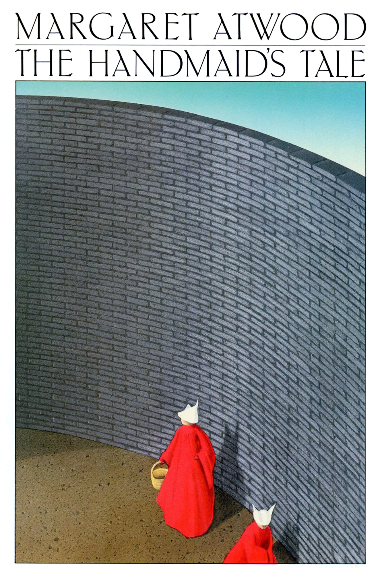
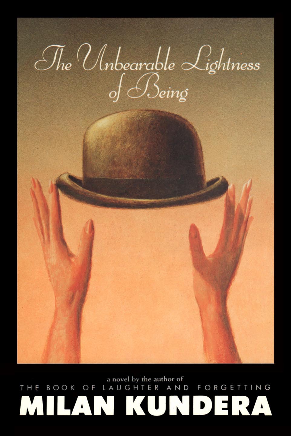
“Marcellino gave authors including Anne Tyler, Tom Wolfe, Milan Kundera, Judith Rossner, Margaret Atwood and Primo Levi, to name but a few, a visual persona that underscored their words and ideas. Marcellino’s distinctive personal style never conflicted with the writers’ character, but like the best graphic interpreters he added dimension that was not always there.” –Steven Heller, Art Director/Critic
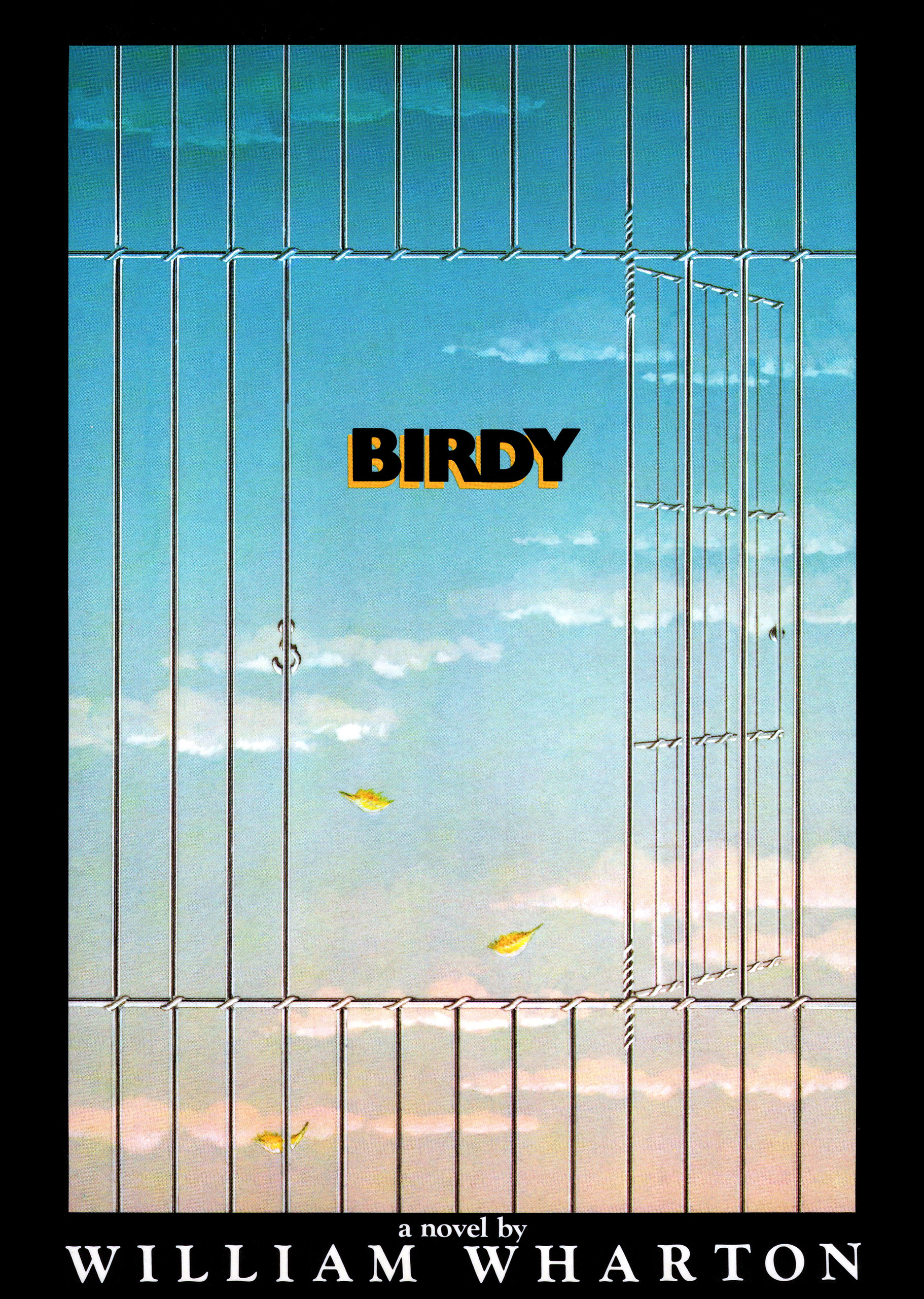
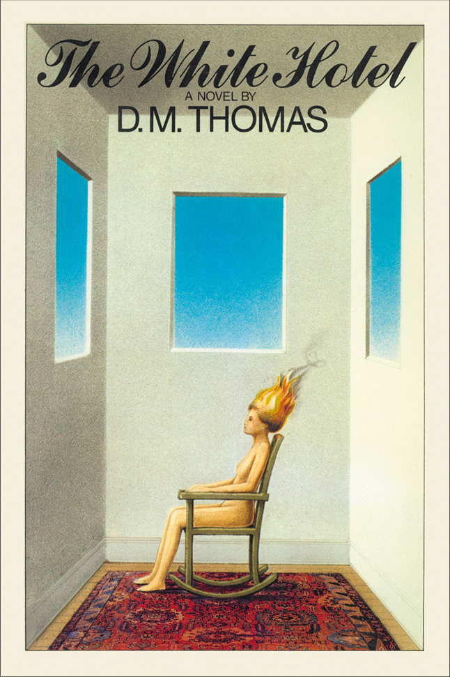
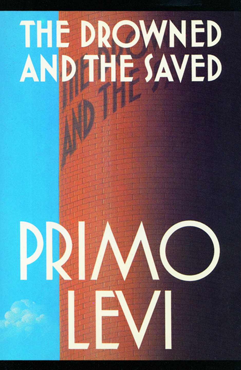
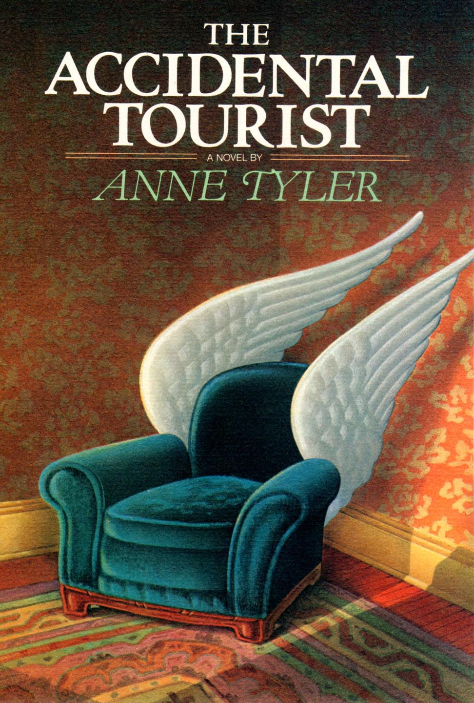
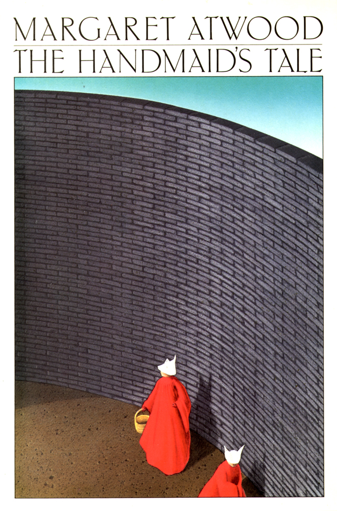
For over ten years, Fred Marcellino remained the pre-eminent book jacket designer in America. Some of his most famous covers include Birdy (1980) by William Wharton, The Bonfire of the Vanities (1987) by Tom Wolfe, The Handmaid’s Tale (1986) by Margaret Atwood, The White Hotel (1980) by D. M. Thomas, The Unbearable Lightness of Being (1985) by Milan Kundera, The Drowned and the Saved (1987) by Primo Levi, Dinner at the Homesick Restaurant (1982) and The Accidental Tourist (1985) by Ann Tyler.


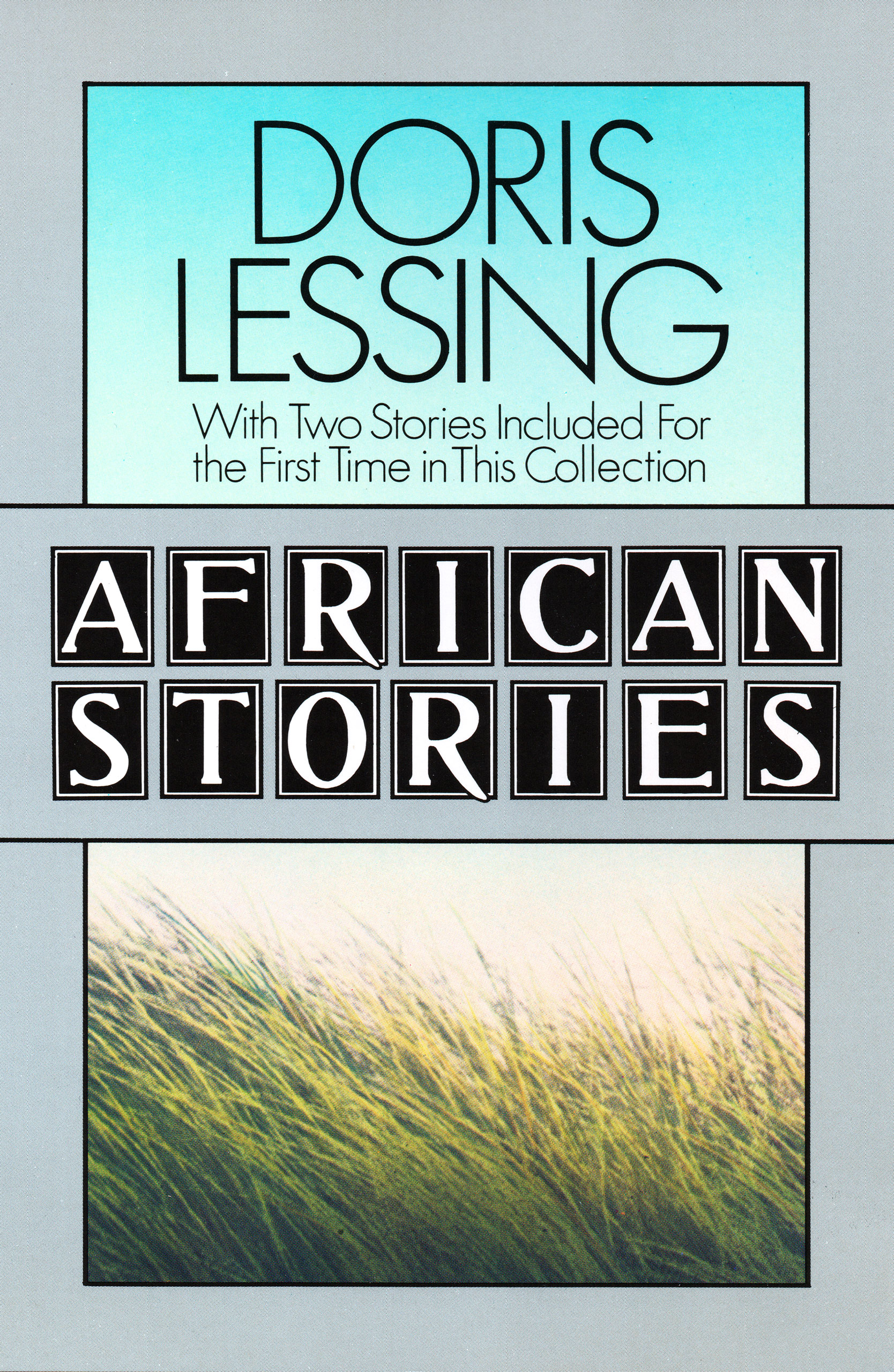
From 1980 until 1983, The National Book Awards included the category of jacket design for the first time. Marcellino won the prize, the “Nevelson,” in three of the four years: Birdy (1980) by William Wharton, African Stories (1982) by Doris Lessing and Souls on Fire (1983) by Elie Wiesel. One year he received three out of the five possible nominations. In spite of his obvious success in the field of book jacket design, his interests began to shift in an entirely new direction: the children’s book.
“Each picture is a link in a chain, and they all exist in counterpoint with the text. And although you want each picture to have impact, just like a jacket, the book illustration can also be much more subtle. It can be pondered and savored over a period of time. It’s a very different discipline from what I was used to, but I must say it was love at first sight.” –Fred Marcellino
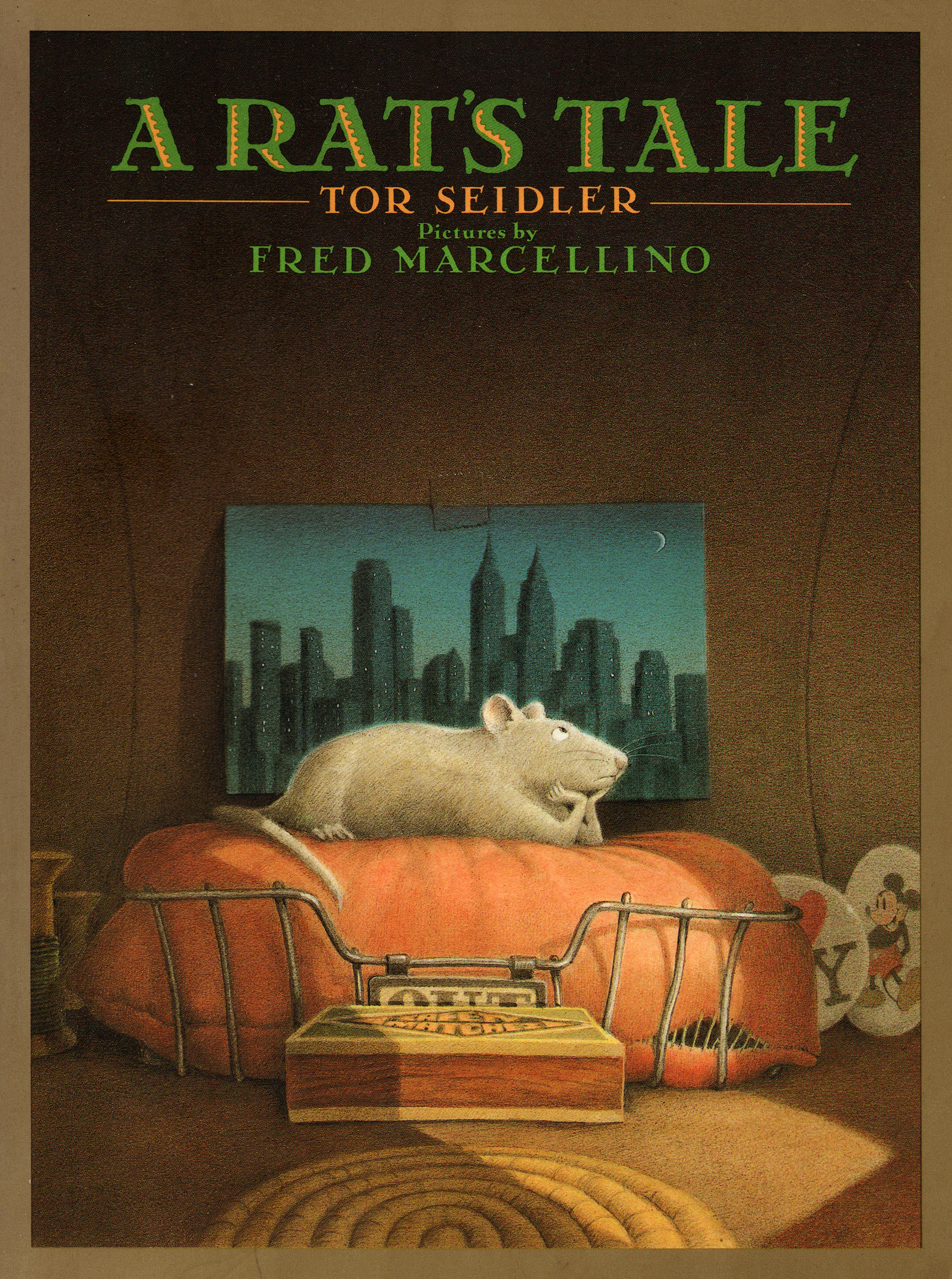
His first effort in this new arena was a successful collaboration with Tor Seidler in the creation of A Rat’s Tale. From the beginning, Marcellino recognized a special rapport with Michael di Capua, then an editor at Farrar, Straus & Giroux. It proved to be a fruitful alliance for many years and many projects thereafter. In this early foray into children’s book art, Marcellino was essentially the illustrator of Seidler’s storybook. These pictures, while extremely compelling, in effect played second-fiddle to the story itself.
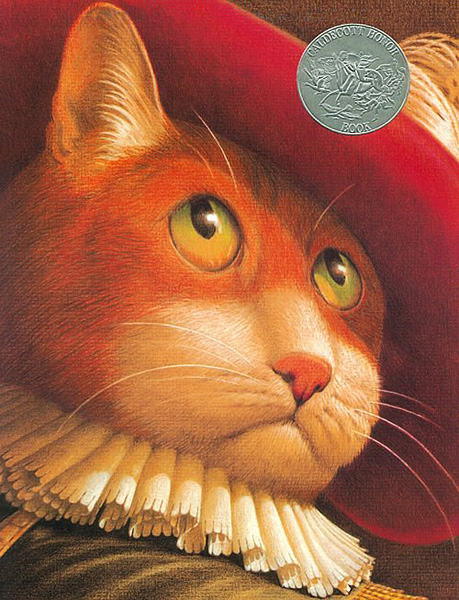
So the next step was clearly to produce a picture-book. Di Capua advised Marcellino to have a look at the famous tale by Charles Perrault written in 1695, Puss in Boots. Having culled through dozens of stories in search of the right one for nearly a decade, Marcellino immediately recognized the pictorial possibilities in the text, and agreed to take on the project. He then produced a body of illustrations in colored pencil with a degree of refinement rare in the field. The story’s historical setting allowed him to give free-reign to his penchant for the Baroque, and to his admiration for late-Renaissance perspective explorations. When he tackled the cover design, he found “no room for the type.” His long-standing devotion to typography notwithstanding, this now famous image of Puss was allowed to grace the jacket unencumbered. In a highly unusual gesture, the Caldecott committee elected to bestow its coveted “Honor” award on this first picture book effort.
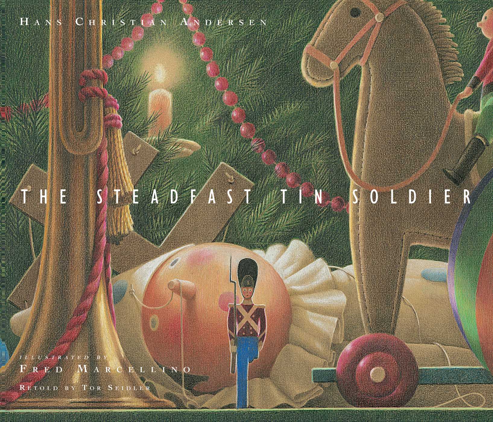
Marcellino followed Michael di Capua in his move to HarperCollins for his next venture, the Tor Seidler retelling of Hans Christian Anderson’s The Steadfast Tin Soldier. Taking a hint from George Balanchine’s choreographic adaptation of this tale of a little boy enchanted by a birthday gift, Marcellino turned it into a Christmas story by simply omitting the word “birthday,” and allowing the imagery to do its work. As always, his research was exhaustive, on this occasion taking him to Copenhagen in pursuit of reference material.
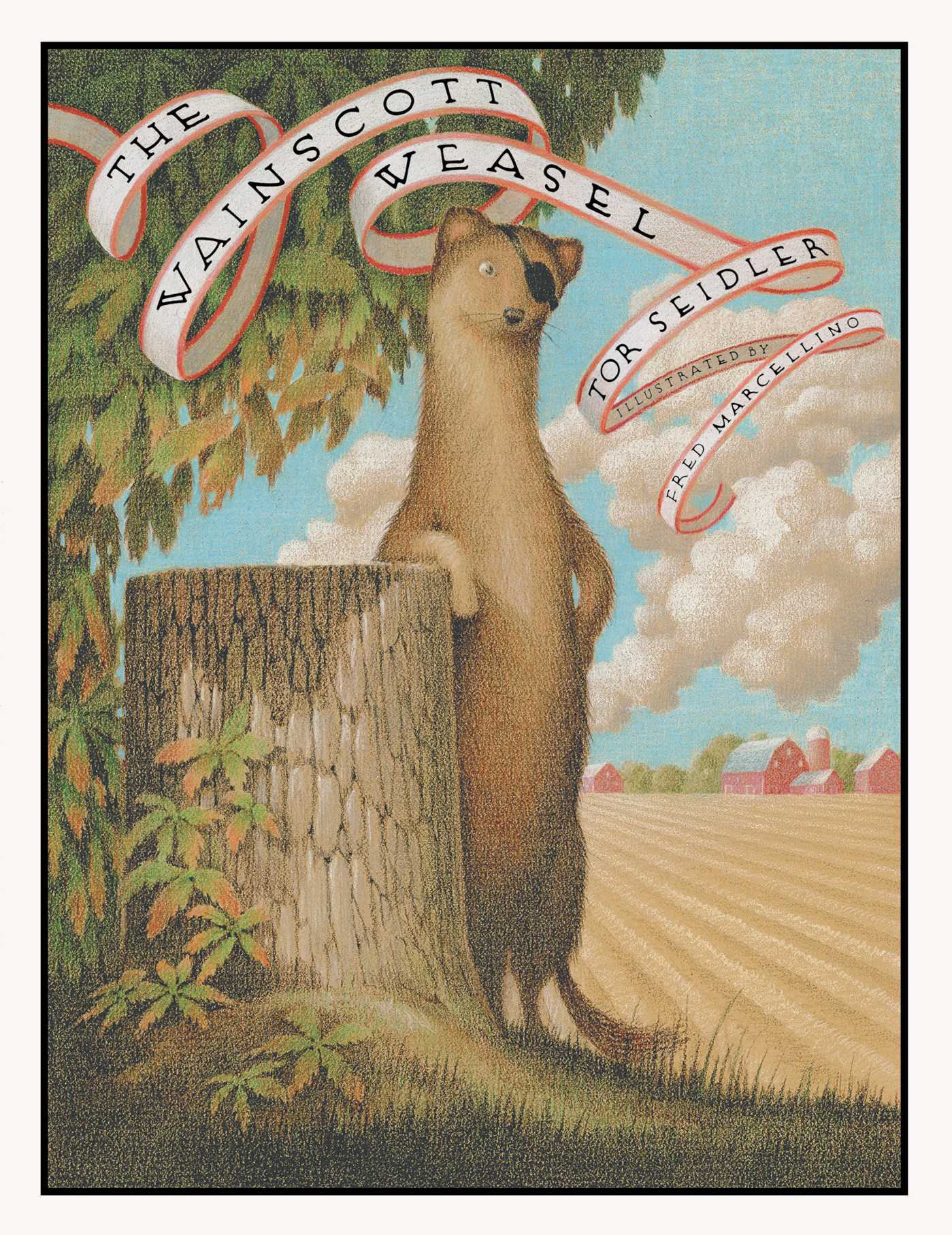
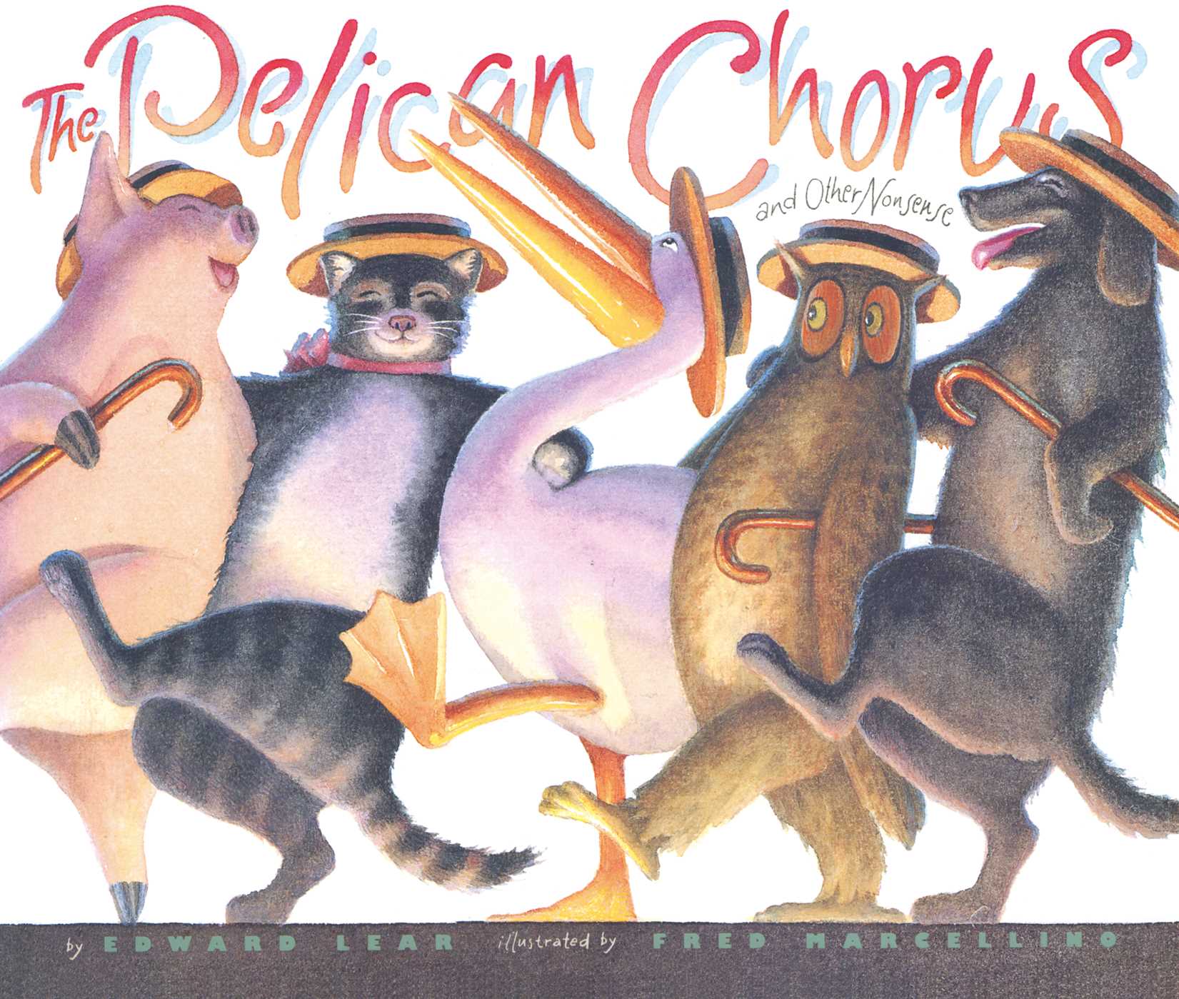
Another collaboration with Tor Seidler was Marcellino’s next venture, an illustrated storybook called The Wainscott Weasel. He was, however, most eager to return to the production of another classic picture book. Finding colored pencil somewhat confining, Marcellino decided to try his hand at watercolor, a medium he’d neglected since his school days. He asked his good friend, the well-known illustrator Jim McMullan, to give him a lesson. After an afternoon’s session, he embarked on his next project, the watercolor rendition of three Edward Lear tales in verse, The Pelican Chorus.
In late 1994, an Op-Ed article appeared in the New York Times lamenting the writer’s observation that, while the concept of “political correctness” had brought about some worthy alterations of behavior, it had simultaneously diminished some of the texture of our lives. In response to this piece, a librarian from the Mid-west wrote a letter-to-the-editor in which she noted her agreement with the article’s observations, adding that a case-in-point from her own experience was the virtual shunning of a story she regarded as the “best ever written in children’s literature.” She referred to Helen Bannermann’s The Story of Little Black Sambo. This exchange of ideas was highly meaningful to Marcellino, who regarded that book as his childhood favorite, and it provoked an interest in revisiting the work to see whether the text was, indeed, a racist tract. He suspected that his naïveté as a child might have prevented awareness of a negative message.
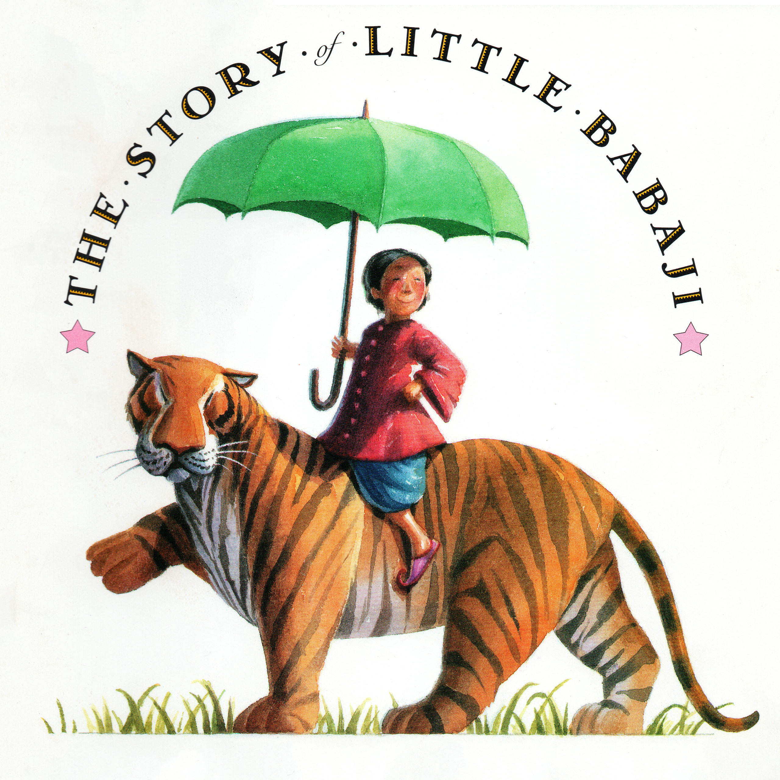
To his delight, he discovered that the story of Little Black Sambo itself was as innocently beautiful as he’d remembered, but the illustrations which accompanied it in the original version were offensive, as were the names of the characters. Upon investigating further, he learned that the story was set in India, where Bannermann was living with her husband, who was stationed there during the Raj. Marcellino realized that he could re-illustrate the story, place the action back into India where it was intended to be, and by merely changing the names of the three main characters, he could leave the text completely intact. The result was his best-selling book, The Story of Little Babaji.
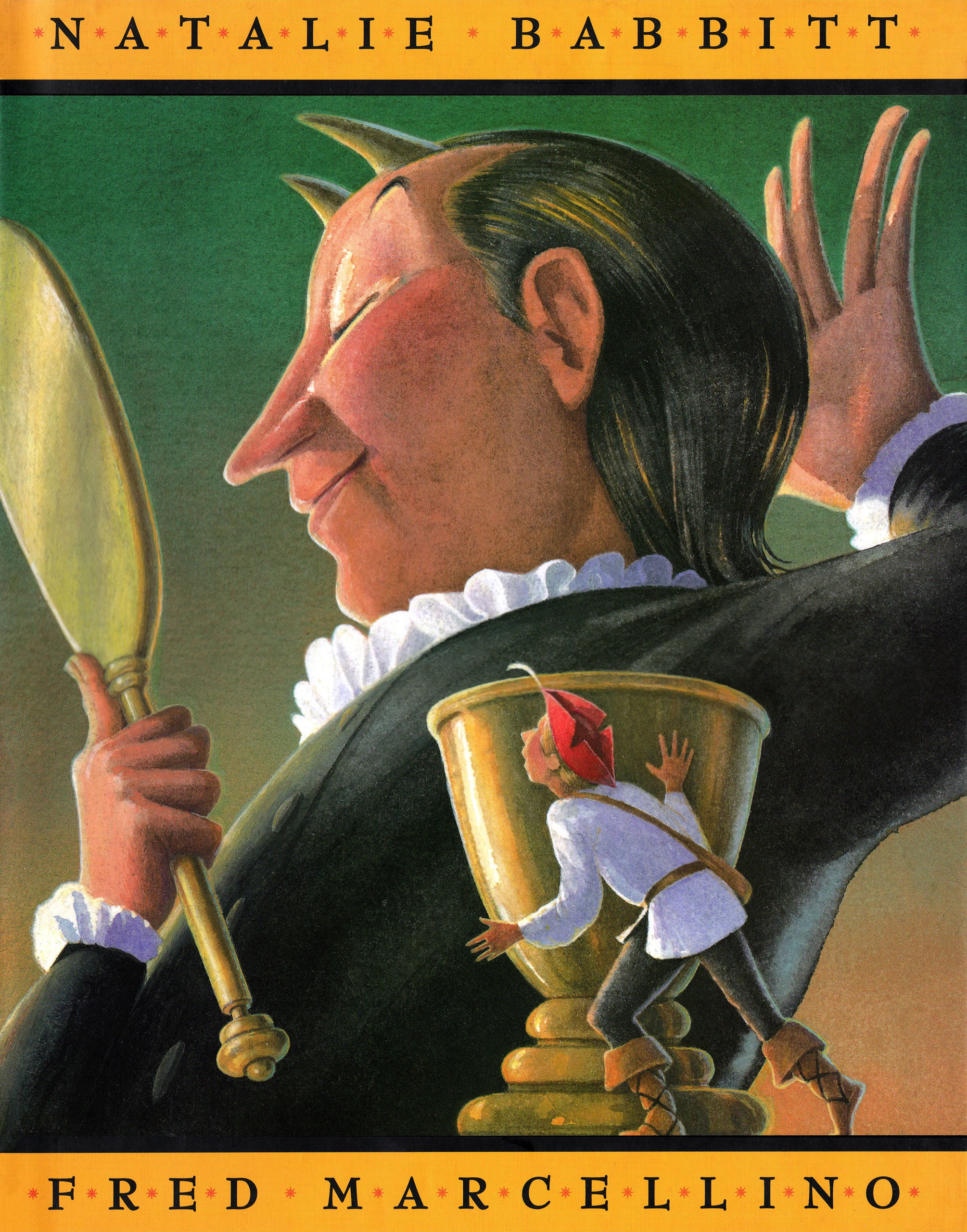
Having always been addicted to the imagery of the Renaissance in Italy, Marcellino placed his next story there, although the Grimm Brothers never specified exactly where the action takes place in The Devil’s Three Golden Hairs, renamed Ouch!: A Tale from Grimm. He collaborated on this book with the renowned author, Natalie Babbitt.
Although resurrecting classics was greatly satisfying to him, Marcellino regretted what he considered to be an innate inability to write a work of his own. In 1998, while savoring some old illustrations by Grandville, he came upon the tale of a crocodile who had the misfortune to be abducted to Paris by Napoleon. This seemed to trigger some new energy. Marcellino began to write, and write furiously. He authored three children’s books in one month, all of which were enthusiastically received by Michael di Capua.
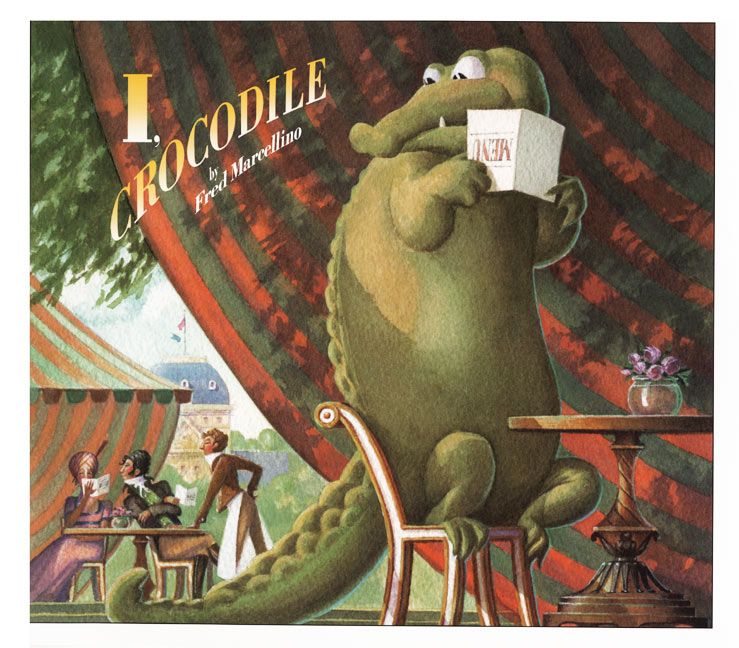
In the midst of embarking on this new career twist as an author, with his first writing effort I, Crocodile still in its beginning stages, Fred Marcellino was diagnosed with inoperable colon cancer. Displaying enormous determination, he continued to work in spite of debilitating chemotherapy treatments. Ironically, it has been observed that in the illustrations for I, Crocodile, Marcellino exhibited his greatest joie de vivre. The book was an immediate success and won numerous awards.
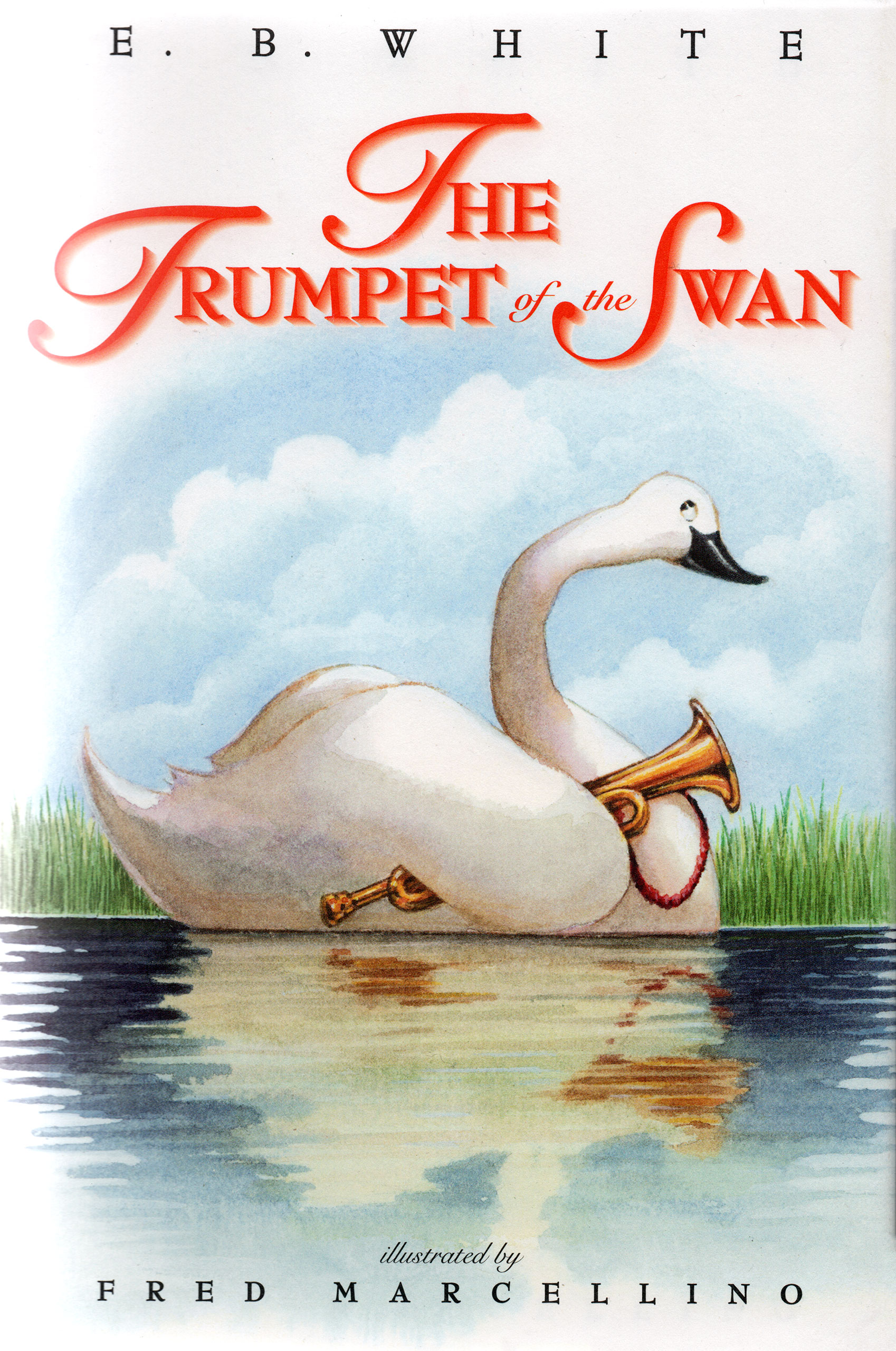
His agent, Holly McGhee at Pippin Properties, offered the support and belief he needed in securing two more book contracts at a time when his survival was in jeopardy. The result of the first was a re-illustration of E. B. White’s classic The Trumpet of the Swan, which Marcellino was able to successfully complete. The second, a sequel he authored featuring his beloved character to be called Arrivederci, Crocodile, remained unfinished at his death on July 12, 2001.
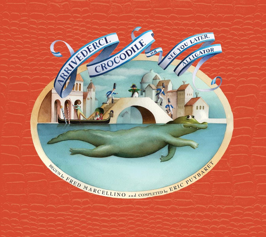
On September 10, 2019, exactly 20 years after the publication of I, Crocodile, its sequel, Arrivederci, Crocodile was published featuring the illustrations of Eric Puybaret.